Wednesday, 15 December 2010
Paramore photos for my Contents page
I went to go see the band paramore on the 11th november 2010. Some of the photos i took i thought would be great to use on my contents page. So my magazine will include images of an actual world wide band performing live which goes with the paramore tour story in my magazine. Paramore is also a band what goes with the genre of my magazine, Alternative Rock.
MAGAZINE PHOTOS AND POSTER SPECIAL
Posters for magazine
These are picture i have created using photoshop for gcse art. I decided to use these images for my magazine front cover where the poster special is. People can then get posters for upcoming festivals.
Friday, 10 December 2010
Drafts
Front cover
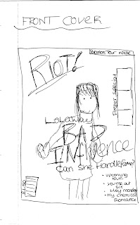
This is my first draft of the front cover for my music magazine.
This is my second draft of the front cover of my music magazine.
This is my third draft of the front cover of my music magazine.
Contents page
This is my first draft of the contents page for my music magazine.
This is my second draft of the contents page for my music magazine.
This is my third draft of my contents page for my music magazine.
Double page spread
This is my first draft of a double page spread for my music magazine.
This is my second draft of a double page spread for my music magazine.
This is my third draft of a double page spread for my music magazine.
Drawing Drafts
Front Cover
Contents Page
Double Page Spread
Ideas
FRONT COVER
For my front cover i plan to have a female on the front who is the lead singer of a band. I plan to just have the girl in the image either on a mid shot or a long shot against a white background. The girl i use will represent the alternative rock genre.
CONTENTS PAGE
My contents page will include features, regulars that are from the magazine and will also have relevant images that will be in the magazine. I want my contents page to be easy to understand and help readers what they want straight away. On my contents page i will have an image of the girl featured on the cover with a brief description on what the interview is going to be about.
DOUBLE PAGE SPREAD
My double page spread is going to be the interview on. The page spread will have one large image that fills one page and will have a headline and a pull quote. The opposite page will have the interview with smaller images of the girls band and the member that she is currently seeing.
GIRLS NAME: Lola Way
BAND NAME: Bad influence
STORY: lolas parsonal life been talked about, can she handle it?
MAGAZINE NAME IDEAS
- RIOT!
- Volume
- LOUD!
I think i'm going to go with the name RIOT! Riot means a disorganised group that lashes out and rebels. To me this is what the rock genre is about... Been rebellious so i feel that the name is very suitable.
COLOUR SCHEME
These are the colours i plan to use on my front cover and keep consistent through my magazine. These colours are quite dark but i still think they are vibrant and i think they suit the genre.
FONTS
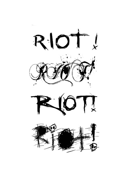
I chose these fonts because i like the messy sort of style. Because the magazine's genre is rock and it is going to RIOT! i thought a messy sort of style would be needed to represent not only the genre but the audience. I really like the second font but i think it will possibly quite hard to read. I like the third font it is easy to read and goes with the genre. The fourth font i like because of the skulls used. I have decided to use the bottom font because its messy looking and goes with the genre. It represents rock well.
Subscribe to:
Comments (Atom)


