Friday, 10 December 2010

Drafts

Front cover


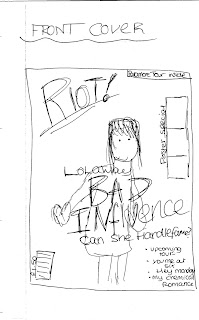
This is my first draft of the front cover for my music magazine.


This is my second draft of the front cover of my music magazine.


This is my third draft of the front cover of my music magazine.

Contents page


This is my first draft of the contents page for my music magazine.


This is my second draft of the contents page for my music magazine.


This is my third draft of my contents page for my music magazine.


Double page spread


This is my first draft of a double page spread for my music magazine.


This is my second draft of a double page spread for my music magazine.


This is my third draft of a double page spread for my music magazine.

Drawing Drafts

Front Cover
Contents Page


Double Page Spread


These drawings pretty much show how my actual magazine is going to be layed out.


Ideas

FRONT COVER
For my front cover i plan to have a female on the front who is the lead singer of a band. I plan to just have the girl in the image either on a mid shot or a long shot against a white background. The girl i use will represent the alternative rock genre.

CONTENTS PAGE
My contents page will include features, regulars that are from the magazine and will also have relevant images that will be in the magazine. I want my contents page to be easy to understand and help readers what they want straight away. On my contents page i will have an image of the girl featured on the cover with a brief description on what the interview is going to be about.

DOUBLE PAGE SPREAD
My double page spread is going to be the interview on. The page spread will have one large image that fills one page and will have a headline and a pull quote. The opposite page will have the interview with smaller images of the girls band and the member that she is currently seeing.

GIRLS NAME: Lola Way
BAND NAME: Bad influence
STORY: lolas parsonal life been talked about, can she handle it?

MAGAZINE NAME IDEAS
- RIOT!
- Volume
- LOUD!

I think i'm going to go with the name RIOT! Riot means a disorganised group that lashes out and rebels. To me this is what the rock genre is about... Been rebellious so i feel that the name is very suitable.

COLOUR SCHEME
These are the colours i plan to use on my front cover and keep consistent through my magazine. These colours are quite dark but i still think they are vibrant and i think they suit the genre.

FONTS


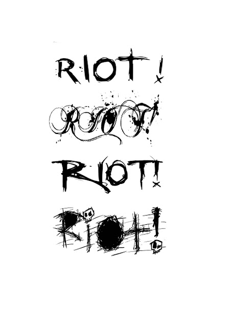
I chose these fonts because i like the messy sort of style. Because the magazine's genre is rock and it is going to RIOT! i thought a messy sort of style would be needed to represent not only the genre but the audience. I really like the second font but i think it will possibly quite hard to read.  I like the third font it is easy to read and goes with the genre. The fourth font i like because of the skulls used. I have decided to use the bottom font because its messy looking and goes with the genre. It represents rock well.

Price

Looking at the prices of other magazines i have decided that i am going to price mine at £1.50 weekly. I want my magazine to be teens/young adults so i think £1.50 weekly is a good price because it is affordable. My magazine would probably be in competition with magazines like Kerrang and NME. Kerrang costs £2.20 and NME also costs £2.20 so if my magazine is £1.50 it is most likely to be bought as you will be getting the same as the other music magazines for a lower price. If i release it weekly i will get more of a profit, my magazine just wont have as much content as a monthly magazine but when it all adds up the price wont be that much different than a monthly one.

Wednesday, 8 December 2010

Audience


I have done a questionnaire and have also got polls on my blog. I needed to find out what people were intrested in so i asked 14 teens aged 16/17 to compelete my questionnaire and it looks like the genre they are most intrested in is rock/indie also they most prefer acts like paramore and tinne tempah. Im going to make a magazine that is of the rock/indie genre and will have band images for bands like paramore. Also though because i recently went to a Paramore gig and got quite close to the stage i got some really good photos and am going to include them on my contents page.

My Target Audience will be teens who have a love for alternative rock and indie rock. Teens like this usually tend to listen to bands like Paramore, You me at six and All time low. They also probably watch tv programmes like Skins, Shameless, Big bang theory, Celebrity Juice, Peep show and South park. My audience would be male and females. Males would probably tend to wear clothing like skinny jeans and checkered shirts and shoes like military boots and possibly converse. There hair would possibly be quite messy and sometimes wear hats. Females would also probably wear skinny jeans, military boots, vest tops, cardigans and stuff like that. Females hair would also be quite a messy style, girls tend to back comb there hair.

Friday, 26 November 2010

LIIAR

Language:-  What terminology was used? How was the text put together?
Language relevant for my magazine will be camera angles, editing and lightning. For this project i can use whatever camera angle i like for my photos as long as there my own. The magazine will be put together on adobe Photoshop were I will edit the images i use and create each (two page spread & contents) page for the magazine and will add a masthead and a headline to the front cover.      

Institution:- who produced the text?
A magazine would usually have a company, for example,  Kerrang, NME, Q and Metal Hammer but you could also say the publisher is apart of the institution for example, IPC and EMAP. 

Ideology:- Ideology is a system of shared ideas and beliefs and is also our values and morals.
The idea of a music magazine is to be about a certain genre of music to suit certain people. Everything is the magazine has to be suitable for the audience. It has to inspire people, the artist used on the front could inspire people.

Audience:- Who is the text aimed at?
I am going to  to aim my magazine at teens and do questionnaires finding out what a few like best when it comes to a music magazine.

 
Representation:- Who/what/where is represented?
The audience has to be represented with the genre and also the acts on the cover have to be represented.

NME MAGAZINE


Front Cover
NME uses a variety of codes and conventions to make the magazine what it is. The image used on the front cover is a close up of Gerard Way from the band My Chemical Romance. With the the image been a close-up shot it seems more personal as you are looking right at them and only them, the image also gives off the impression that the main story is more personal and about Gerard Way and not the band, even though the headline says 'My Chemical Romance' its saying it for those who don't know who Gerard Way is. The headline of the magazine is 'Gerard sees red MY CHEMICAL ROMANCE "we loathe what goth has become", the last bit is in quotes because it must be something Gerard actually said whilst been interviewed. He's saying how he is disgusted with what goth has become, which would be the kicker of the magazine. The disgust goes with the first part of the headline saying "Gerard sees red" which possibly could mean slight anger. Even though the photo on the front cover is of Gerard Way, the name of the band "My chemical romance" is bigger and stands out more than the rest of the headline because the band is popular and people who don't know the lead singers name, they will definitely know the name of the band.  Gerard Way been on the front cover of the magazine represents the type of genre of music the magazine involves. So the band will appeal to rock/indie music lovers. The colour or Gerard Ways hair also represents the genre. He looks very individual and different and people like that. The splash of the magazine is simple, but eye catching. The Blue in the background is quite bright so that catches peoples eye and the fact its a close up or Gerard Way his bright red hair will stand out more.


The magazine will have been produced by the company NME and also the publisher has something to do with the institution in this case the publisher been IPC. NME will not be the only magazine that IPC publishes, there will be many other magazines off different genres to suit different people so the publishers will get ore of  profit. 

The magazine has been produced to keep people up to date in the rock world. Also to inspire people. People look up to rock stars and will be wanting to know things about them and will want to find out ways to look like them. NME are also having a tour, and the live up is been revealed in this magazine so anybody going to the concert will want to know who the acts are.

The target audience for NME magazine would be anybody who likes rock and indie music. With Gerard Way been on it gives it away that the music is a rock magazine because he is a symbol of rock. People who are fans of My Chemical Romance will probably buy the magazine because they will want to know every single bit of detail about the band. The way Gerard looks is also a good way of showing the certain audience, Gerard looking individual because of his brightly coloured hair.

Individuality is represented on the front cover of this magazine. Gerard makes been individual look good with his hair. Gerard is also representing the rock genre because he is the lead singer from the band My Chemical Romance which is a well known rock band.

Contents Page
NME magazine includes a contents page. This page has many things on it that help the reader find what they want easily and really quick. The contents page helps you get to the page you want by having lists of page numbers with the names of the story next to them so the page can be identified, then you can simply flick to the page number you want and it will give you the information you are interested in. The contents page also includes images which usually relate to stories that are in the magazine and the images also relate to the type of genre that the magazine is, which in this case is indie/rock. Down the left hand side of the page it gives you a band index which is a list of the bands that are included in the magazine. It also gives you the page numbers that these bands are mentioned on, so that would make it easier to flick to pages to read about your favourite band if they happen to be in that list. On the right hand side of the page are more page numbers for the main stories that are involved in this magazine. The main pages of the magazine are sectioned into five groups which are 'news, radar, reviews, live! and features'. In the center of the contents page there is a section on the band oasis, so oasis must be the main band mentioned in this music magazine.  The center section includes images of two of the band members, and there is also a headline that says 'Oasis kicked off their world tour' which goes with why the images used are of them are them performing. Underneath the images is a paragraph about the bands new album that is coming out. At the top of the page is the masthead of the magazine 'NME'. It is different to the masthead on the front cover as it is the actual NME logo that is used on every NME product. At the top of the magazine it says ' this week' along with the date so you know how old/new the news inside is and it stands out with the large font so it is easily noticed. The splash of this contents page is simple and easy to understand. The house style consists on three colours which are white, red and black, these colours all go with the NME logo. Bold text and high lighting is used to help text stand out. There is a regular used on this contents page and that is the advert getting you to subscribe to NME and save money on the magazines. The contents page is presented neatly so it is very easy for the reader to use and understand by using all the typical conventions such as pages, numbers, regulars and features.


The institution of NME magazine is IPC , NME are also apart of the institution. NME will not be the only magazine that IPC produces.


The ideological view behind the NME contents page is to make it easier and quicker for people to find what they want.


 NME magazines target audience would be suitable for teens and young/middle aged adults because of the style of the contents page also the bands used would appeal to them people. 


The target audience is represented on this contents page because of the genre that the magazine is. The bands used usually seem the represent the audience because of there style. People tend to look up to there styles and try to look like them. The bands are also been represented, they are been promoted and there genre is been represented. IPC the publisher is also been represented.


Double Page Spread


NME includes a double page spread which is usually an interview or pages that introduce the featured/main artist of the magazine. This double page spread has one large image or Gerard Way performing and 3 smaller images of the band in the recording studio which is what the interview is about. There is a quote from the interview and then there is a brief description of the interview. With the main image been of Gerard Way performing it gives an insight on what he looks like performing and also the main image is of Gerard Way because he is the front man. There is a pull quote used on the double page spread and that would be the quote "were being the best MCR we can be" which makes the reader want to read on. The brief description gives the reader a quick insight of the interview and makes the reader want to find out more of whats going on.


NME magazine is published weekly by IPC. NME will not be the only magazine published within the company. They also publish LOOK magazine which is a fashion magazine along with many more which give the company more profit as there will be more of an audience.


The ideological view of NME's double page spread is to introduce the interview of the featured artist . It has to inform, persuade and lock the reader in to wanting to read more into the article. the want the audience to be interested and enjoy the article.


The target audience for teen/indie/ any one who likes modern rock sort of people. This article would interest my chemical romance fans. The images used on the double page spread always go with the front cover of the magazine and always relate to the type of genre that the magazine is which is usually the genre for the people that read it (indie). MCR have been interviewed for the double page spread this is because they are well known and will inspire the audience.


The double page spread represents its target audience by using images and features that relate to the genre of music. The double page spread also represents the band as the band represents the genre of music the audience likes. The artists are also represented and the magazine has to make there representation good. 


My Chemical Romance - NA NA NA

Q MAGAZINE

Front Cover
Q uses a variety of codes and conventions to make the magazine what it is. The masthead of the magazine is quite behind the image but that does not matter because you can still easily tell it's a Q magazine because of the red colour used on the masthead, the masthead is also the logo of the Q company and is used on every media product Q produce. Q stands for Quality. The image used on the front cover is a long shot of the lead singer Tom Meighan and the guitarist  Sergio Pizzorno, from the band Kasabian. A long shot has been used so it fits the view in. The view been Tom Meighan, Sergio Pizzorno and the guitar. It is also used to show the style of clothing as many people just go for image to try and look like there favourite stars. Both men are looking directly to the camera which makes it look like they are looking at the audience which is a way of inviting the audience in. The main band that is going to be mentioned is obviously Kasabian as they are photographed  to be on the front cover. The headline of the magazine is  'THE 101 HOTTEST THINGS IN MUSIC NOW STARRING KASABIAN THEY'RE ON FIRE' along with other bands that are mentioned at the bottom of the magazine, but the headline suggests Kasabian are the hottest thing in music now as there name is the first mentioned and it is bigger and bolder than the rest. The guitar been on fire goes with the part of the headline which says 'they're on fire'. The magazine says at the top 'the uk's biggest music magazine' which would make it understandable to why Q's splash is designed to look very smart, and why the price is £3.90. There is also images of other bands on the front cover, them images been or Arctic Monkeys and Blur, so there is obviously a story about them bands in the magazine. It also tells us about U2 performing live which will be good for promotion of the gig as the magazine is the best selling and it will promote the band alot, even though there already well know. Every band on the cover is well known, Q will have chose them because people like the bands and it will help sell the magazine. The bands on the front cover give away what sort of genre this magazine is and that is Rock/Indie, it is also the style of Tom Meighan and Sergio Pizzorno.


The magazine will be produced by the company Q, but also the publisher Bauer who also helps produce the magazine. Q will have picked Kasabian to be on the front cover because they have a good image what people are inspired by and they are well known and liked by many people so the magazine will sell. Q will not be the only magazine that Bauer publish.

The magazine will be produced to keep people up to date with the bands involved on the cover and also to make them bands look good. Also to inspire are people. People will want to look/dress like members from Kasabian because it is cool. Also it promotes bands that are touring which is a big interest for some people, cause many readers will be people who like to go to as many gigs as possible.

The target audience will be adults/middle class people. With the magazine been £3.90 some people cant afford to pay for that monthly along with food and bills and other things people buy threw a threw a month. Students especcially cannot afford it weekly which is why magazines like Kerrang and NME are more suitable for them. Also with the splash looking smart that gives off the impression that the magazine is for adults.
Rock and Individuality is represented on this magazine. The bands mentioned represent it because of the genre that they are. Also Kasabian represent it with there image, with the whole long hair and leather jackets, the look people want. The whole look makes them look cool along with the facial expressions.  The rock and indie stereotype is represented with the artists that are on the cover.
 The publisher Bauer will also be represented.


Contents Page

Q magazine includes a contents page. This page has many codes ans conventions that make it easier and quicker for the reader to find the pages that they want. The contents page makes this easier by having a list of page numbers with the page title next to it so you can simply just flick to the page with the information on that your interested in. The contents page also includes an image of a band called "the courteeners" which will relate to the genre of the magazine which in this case is indie/rock and there will most probably be a story about the band in the magazine. Down the left hand side of the page is the list of stories that are in the magazine with the page numbers. All the pages are sectioned into 3 groups which are 'features, every month and review'. On the right hand side of the magazine is the image of the band "the courteeners"  and at the bottom is the section what has the page  numbers that are pages with reviews on with an image of Nick Cave. Each image of the band/person has a page number on where they are mentioned. At top of he page is the masthead which is the Q logo, it is used twice on the contents page. It is exactly the same as the masthead on the front cover so it is kept consistent. The Q logo will be used on every single Q product/media based item like the music channel.  At the top of the magazine it says contents and has the date and issue number so you know what number it is and how old/new it is. The splash of this page is smart and simple. Its not to in your face. And the house style is kept consistent with the colours red and white. Bold text and high lighting is used to help text stand out. The contents page is presented neatly so it is very for the reader to use and understand by using all the typical codes and conventions such as pages, numbers and features. there are no regulars used on this contents page.

The institution of Q magazine is Bauer , Q are also apart of the institution. Q will not be the only magazine that Bauer produces. They will produce different magazines of a different genre.


The ideological view behind the Q contents page is to make it easier and quicker for people to find what they want.


Q magazines target audience would be suitable for middle class adults. As I have said before some people cannot afford £3.90 monthly especially teens so I think the magazine is more suitable for adults. Also because the contents page is very smart it would appeal more to them.


The target audience is represented on this contents page because of the genre that the magazine is and also the style of the contents page. The bands used usually seem the represent the audience because of there style. People tend to look up to there styles and try to look like them. The bands are also been represented, they are been promoted and there genre is been represented. Bauer the publisher is also been represented.


Double Page Spread
                                                                                                                                        

Q magazine always has a double page spread which is usually an opening page to introduce an interview or an actual interview itself of an the featured artist on the front cover. This double page spread has a large image of Lady Gaga then has the headline "she's the man" which will go with all the rumours of her been a man. There is then a small bit of writing what is a brief description of the interview. "she's the man" is a pull quote what will catch the audiences attention and make them wonder why she's the man so they will read it. The brief description gives a quick insight of the interview and makes the reader want to carry on reading.

Q magazine is published weekly by Bauer. Q will not be the only magazine published within the company. They also publish KERRANG! magazine which is another music magazine of the genre rock and metal. They will publish many more magazines cause the different genres that suit different people will give them more of a profit.

The ideological view of Q's double page spread is to introduce the interview of the featured artist . It has to inform, persuade and lock the reader in to wanting to read more into the article. They want the audience to be interested and enjoy the article.


The target audience is for adults any one who likes modern indie and old indie music. This article would interest Lady Gaga fans. The image used on the double page spread always go with the front cover of the magazine and always relates to the type of genre that the magazine is which is usually the genre for the people that read it (indie). Lady Gaga has been interviewed for the double page spread, this is because she is well known and will inspire the audience.


The double page spread represents its target audience by using images and features that relate to the genre of music. The double page spread also represents Lady gaga as Lady Gaga represents the genre of music the audience likes. The artist is represented and the magazine has to make there representation good. 


Kasabian - Vlad the impaler